Case Study · Fintech Platform

We achieved our goal too well and had to pivot.

FinPath is a financial wellness platform that employers buy for their staff, built by TCG, a HUB International company. In the third iteration I kept the AI assistant front and center, then made sure coaching, courses, and benefits actually got discovered.

Role

Lead Product Designer

Team

Solo design, with PM and eng

Timeline

2024 to 2025

Tools

Figma, Framer

01
The Problem

We pushed the AI so hard that users stopped seeing everything else.

The AI worked so well that people stopped opening coaching, courses, and benefits. But employers renew when their staff use what they pay for. The fix was not a cleaner layout. It was giving people a reason to come back.

  • First Iteration

    First Iteration

    The first redesign brought order to a cluttered dashboard. A STEPScore quiz read each user's financial readiness, then pointed them to the right tools, courses, and coaching.

    The first redesign brought order to a cluttered dashboard. A STEPScore quiz read each user's financial readiness, then pointed them to the right tools, courses, and coaching.

  • Second Iteration

    The homepage led with one ask bar, "How can I help?", powered by AI. Below it sat three cards: 1-on-1 Coaching, Smart Guidance, and FinPath University, with the AI marked as Recommended.

  • Third Iteration

    The AI grew into a full Digital Money Assistant hero, ask anything, pick a topic, get answers. Below it, three paths: Workplace Benefits, Coaching, and FinPath University, with benefits finally pulled onto the dashboard. Keep the assistant, surface the rest.

  • First Iteration

    The first redesign brought order to a cluttered dashboard. A STEPScore quiz read each user's financial readiness, then pointed them to the right tools, courses, and coaching.

  • Second Iteration

    The homepage led with one ask bar, "How can I help?", powered by AI. Below it sat three cards: 1-on-1 Coaching, Smart Guidance, and FinPath University, with the AI marked as Recommended.

  • Third Iteration

    The AI grew into a full Digital Money Assistant hero, ask anything, pick a topic, get answers. Below it, three paths: Workplace Benefits, Coaching, and FinPath University, with benefits finally pulled onto the dashboard. Keep the assistant, surface the rest.

  • First Iteration

    The first redesign brought order to a cluttered dashboard. A STEPScore quiz read each user's financial readiness, then pointed them to the right tools, courses, and coaching.

  • Second Iteration

    The homepage led with one ask bar, "How can I help?", powered by AI. Below it sat three cards: 1-on-1 Coaching, Smart Guidance, and FinPath University, with the AI marked as Recommended.

  • Third Iteration

    The AI grew into a full Digital Money Assistant hero, ask anything, pick a topic, get answers. Below it, three paths: Workplace Benefits, Coaching, and FinPath University, with benefits finally pulled onto the dashboard. Keep the assistant, surface the rest.

02
Three decisions that shaped it

1.

Keep the AI as the hero

Feedback was clear that the assistant was the draw. The goal was never to demote it. It was to make sure it wasn’t the only thing anyone saw.

1.

Keep the AI as the hero

Feedback was clear that the assistant was the draw. The goal was never to demote it. It was to make sure it wasn’t the only thing anyone saw.

2.

Preview the rest, don’t force it

Users never clicked the other resources because the AI took all the attention. So a first-run tour introduces coaching, courses, and benefits the moment you land.

2.

Preview the rest, don’t force it

Users never clicked the other resources because the AI took all the attention. So a first-run tour introduces coaching, courses, and benefits the moment you land.

3.

Retention was a content problem

People had no reason to come back because nothing was new. FinPath University went from a course or two a quarter to fresh content every two weeks.

3.

Retention was a content problem

People had no reason to come back because nothing was new. FinPath University went from a course or two a quarter to fresh content every two weeks.

03
The Solution

Lead with the AI. Put everything else one glance away.

AI assistant, front and center

A Digital Money Assistant hero. Ask a question, pick a topic like budgeting or retirement, and get answers you can act on.

Three paths, right below

Workplace Benefits, Coaching, and FinPath University sit under the assistant, each previewed so people know what they offer.

Benefits, finally findable

Employee benefits moved out of the AI tool and onto the dashboard as their own path, because clients kept asking and no one could find them.

A first-run tour introduces all four the moment you land, and FinPath University now ships fresh content every two weeks.

04
The Screens

The third iteration, up close.

Main Dashboard
discovery tooltips
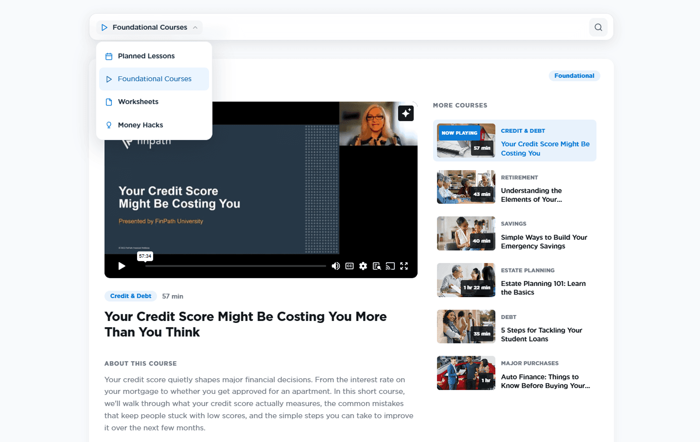
revamped education center
05
Where it stands

The goal was never more AI. It was making sure everything employers pay for actually gets used.

This is the latest iteration, shipping now. The real test is whether discovery and fresh content lift usage of coaching, courses, and benefits over time.

3 tries

Iterations: clarity, then AI, then balance

4 paths

AI, benefits, coaching, courses. One dashboard

2x/week

New course content, up from quarterly

06
Reflection

The AI was never the problem. Discovery was.

What surprised me

The fix was not fighting the assistant. It was giving people a reason to look past it. A first-run preview and fresh content did more than any layout change.

What I’d do differently

Instrument discovery from day one. I would track whether the tour and the surfaced benefits actually move people into coaching and courses, so the next iteration argues with data, not hunches.